Before proposing to my beloved, I wanted to create something that would celebrate our story and make the moment very special. I relish learning about how others approach the important things in their lives, so I wanted to share the process behind this particular one-of-a-kind project because it’s been so beautiful, enriching, and humbling. Let’s get some important context out of the way first:
I take details and matters of the heart incredibly seriously.
Molly and I have both looked forward to starting our engagement with a classic proposal: a diamond ring, a bent knee, and a special moment that we’ll remember for the rest of our lives.
Ornate, bespoke, complex, one-of-a-kind projects are one of my love languages. This has taken me through some interesting projects before, and likely will again.
This is how I became Molly’s fiancé.

After over six years with Molly and almost as much time knowing she’s the one I want to marry, I started getting ready to propose at the top of 2023.
Every proposal is special in its own way, so it’s perfectly valid if a person doesn’t have the time, bandwidth, or desire to spend over a year making an heirloom before popping the question. A commonly-held belief is that you know when it’s right and that’s enough. In fact, that probably means you’re a sane and reasonable person. Some of us, though, feel the need to make a lot of work for ourselves when approaching a major life milestone.
I intend to propose exactly once in my life, so I wanted to make something beautiful that honors the commitment represented by a proposal. Some people say that love is often connected to attention. I wanted to give my proposal to Molly a LOT of attention. There were plenty of times when I thought “man, I don’t even know if Molly would want me to spend time on this”, but then I would think about the long arc of our lives and how the time I’m spending on this project is relatively short. I didn’t want to regret not putting more thought or effort into it.
Early in our relationship, Molly had made it clear to me that the earliest age she would want to get engaged was 27. To this day, I think it was an incredibly wise decision. We’ve had enough time to at least glimpse what life is like together, and I’m grateful that both our families respected our desire to not rush into forever.
At the end of 2022, Molly had been 27 for a comfortable amount of time. We were living in Austin and less than thrilled about how Texas had panned out for our careers, happiness, or lives in general, but we were as happy as ever to be together.
We started looking at rings.

As a zillennial couple, we had plenty of opinions about diamonds. For reasons mostly concerning ethics, Molly said that she would be happiest to wear a synthetic, lab-grown diamond. Visually and chemically, the difference between a lab diamond and a natural diamond is imperceptible, but a lab diamond is far less likely to have involved any cruelty in its provenance. Molly is a woman who values value, so the difference in price also factored in. To some, natural diamonds are the no-brainer preference as symbols of unbreakable love and commitment; to choose otherwise could be regarded as far less romantic or even cheap. I happen to think that there’s something hopeful about human ingenuity finding a way to synthesize diamonds and make them available to a wider market. For a lifelong commitment, I choose hope over romance.
We visited three jewelers in Austin’s Domain shopping district: Blue Nile, Brilliant Earth, and Tiffany (for fun). During our most recent trip to see Molly’s family, we also visited a local shop: Mathew Jewelers. The Mathew family has been in the jewelry trade for five generations, their store replete with portraits of its previous proprietors hanging on the wall by the entrance. We were helped by the current owner, Phil, who knew Molly’s dad, and his son Griffin. I knew that Molly wanted some part of the ring made by the Mathew family, and kept their information close at hand after this first visit.
When you visit a jeweler for the first time to look at engagement rings, you’re going to receive a lot of educational material about the 4 Cs. I carried my notebook with me, trying to educate myself as quickly as possible beyond cut, color, clarity, and carat. What did Molly like? What was the vocabulary to express what she likes? What words would I eventually use to describe Molly’s ideal ring to a jeweler? Some concepts were easy: a diamond larger than 1 carat looks too big on her finger (her words), rose gold complements her complexion, and she prefers a classic oval cut. But there were also the more opaque concepts: length-to-width ratio, girdle, CVD vs HPHT process… Before I knew it, I had several pages of sketches, notes, and an album of photos on my phone.

One interesting design consideration stood out most: Molly expressed that she would love to incorporate stones from a piece of family jewelry into her wedding band. Her great, great grandfather was a jeweler, and had created an ornate crucifix for his wife with a level of craft that impressed every other jeweler who ever put a loupe to it. Molly’s mom had been waiting for the day that it would be lovingly disassembled to incorporate into the next generation’s vows.
I thought it was beautiful. I also concluded that I needed to commission the engagement ring and wedding band simultaneously. That way, the rings would be a good-looking pair and sit flush against one another on Molly’s finger. It’s a common design approach: begin with the end in mind. Buying both rings at once might have seemed a bit forward, but I was happy to feel so confident that a) Molly would say yes to my proposal and b) we would make it to the altar.
After exchanging emails and references with Griffin, I was ready to get started. Molly’s mom delivered the diamond cross to Mathew Jewelers in February 2023, and by mid-March its stones had been set into a beautiful wedding band.

After having been in Molly’s family for generations, this cross was used to make her wedding band.
After a bit more research, contemplation, and covert email correspondence, I was ready to purchase the diamond for the engagement stone. However, like many family jewelers, the Mathews elect not to sell synthetic diamonds because they can’t guarantee any resale value. It’s an understandable choice, but it left me with a decision that felt huge at the time: even though the Mathew family would make the actual engagement ring, where would I buy the diamond? I had seen Uncut Gems. I felt uneasy about a foray into the world of precious minerals.
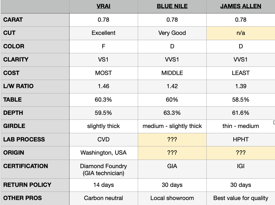
Ideally, I would have been able to find a supplier with such an impeccably transparent supply record that they could introduce me to the person running the diamond-growing machine on my stone’s creation date. That same supplier would also offer GIA certification, stock a selection of diamonds in every possible permutation of the 4 Cs, and welcome me to a same-day appointment in their local showroom to look at any diamond I could ever ask to see. At the appointment, there would have been scratch-made baked goods and light refreshments. Alas, what I’ve described is a fantasy, and I was only aware of three options in my price range: Blue Nile, James Allen, and a newer company called VRAI.
I picked Blue Nile because they had a showroom in Austin. I might never learn who brought the diamond into creation, but I could at least see it in person before making the purchase. The salesperson was incredibly friendly and patient with my compulsive note-taking, and had been very helpful to Molly during our visit earlier in the year.
The buying process was split into two visits. At the end of March 2023, I made an appointment to see the diamonds they had available in their showroom. While none of them fully met the criteria, the Blue Nile staff showed me another diamond from the larger Blue Nile supply and arranged to have it delivered to their store for pickup. Blue Nile, like most diamond sellers, also provided 360° macro images of each stone that I could view before making the purchase.
I purchased that diamond because it looked perfect on paper, and I knew that I could return it later. In hindsight , I suppose I didn’t really have any reason to doubt that the diamond’s specs on paper could somehow be misinterpreted. I returned a few days later in early April, examined the diamond I had selected under a loupe, signed the final paperwork to finalize its purchase, then took it home to hide.
Sometimes, before I was able to drop the diamond off with the Mathews, I would take it from its secret hiding place and hold it (in its see-through packaging), imagining the day it would finally get to Molly’s hand. I only had the smallest inkling of how much more effort would be involved in getting ready for that day. I was waiting for the right opportunity to deliver the stone to the Mathews in person, but would need a reasonable explanation for visiting Molly’s hometown.
Thankfully, Taylor Swift had already intervened on my behalf.


The Eras Tour, aka the highest-grossing music tour in history, kicked off its status as a cultural juggernaut in 2023 and as of writing is still going strong. Molly and her sister Megan were willing to travel anywhere to see the show, but their ticketed venue would be determined by a convoluted and now-infamous ticketing lottery system. How do I know this? Because back in November of 2022, I sat in front of two laptops for nearly four hours trying to make these tickets happen.
It was the only solution. Molly and Megan were both working when the sale started, but I had the flexibility of a self-scheduled job at the time and knew how much they wanted to see their icon perform live. I gathered up all the necessary info: emails, passwords, certified fan codes (that’s a real thing), credit card numbers, backup emails and passwords, ranked venue preferences, and ranked seating preference diagrams for each venue. After an adrenaline roller coaster, punctuated by the various pings and pops of Ticketmaster’s user interface, I had secured two tickets for Pittsburgh’s Heinz Field in June.
Molly and Megan would see the Eras Tour in their home city. I would tag along to Pennsylvania and attend to other business.

I was close to having the engagement ring, and had been lucky enough to get Taylor Swift tickets, but something was missing.
Making purchases didn’t involve the level of reflection and contemplation that I had hoped this time would bring.
For all the love and joy that I feel with Molly, taking notes and swiping my credit card felt less like nearing a major life milestone and more like bringing home a new refrigerator.
At first, I didn’t know what to do with this feeling.
* * * * *
When I accompanied Molly on her pilgrimage to Pittsburgh in June, the folks at Mathew Jewelers were happy to see me again. They managed to turn the diamond into a beautiful engagement ring in the astonishing span of two days. Perhaps it’s no big deal to a seasoned ring-maker, but I was amazed.
On the same night that Molly and her sister fulfilled their dream of scream-singing Taylor Swift’s repertoire at the largest event of any kind to stop in Pittsburgh, I had invited her parents to dinner. I planned to formally share my intentions and ask for their blessing. This was a step that Molly might have considered archaic and perhaps unnecessary, but it was important to me- not because I was following a playbook or treating marriage as a hyper-traditional transfer of property, but because I love her family. They would (hopefully) soon be my new in-laws, and I wanted to continue our great relationship by acting in good faith.


I’ll always be grateful to Phil Mathew for making sure I had the option to propose as soon as we returned to Texas, but it wasn’t time yet. We had started making plans to leave Austin and move to Pittsburgh, favoring its characteristics and proximity to our families on the east coast. A major life transition was looming along with a persistent feeling of I-want-this-to-be-so-incredibly-special. I felt like this season was giving me an opportunity: the time to make the meaning I craved.
I was looking for a level of emotional weight that others might find in their faith or cultural traditions. I had grown up unchurched despite a solid relationship with the divine, and I had technically fulfilled the proposal expectations of early 2000s mainstream secular American culture, but I wanted a rite of passage. I wanted to make my own meaning.
Thanks to the fortunate coincidence of my life circumstances and parents’ interests, I was raised in the church of making. I had been part of the congregation long enough to dream up a homemade project that would offer more meaning than I even realized at the start.
When I was growing up, there was an understood hierarchy of gifting in the Spivey household: handmade, however rudimentary, was always preferred to store-bought. Time, effort, creativity, and expression were my parents’ favorite gifts to give and receive. This worked out because Mom and Dad were (and still are) incredibly capable, crafty people with all the grit befitting their theater-making backgrounds. I grew up around power tools, 3D printers, soldering irons, sewing machines, and all the other tools of creation you might expect in a workshop. I spent no less than 25% of my childhood in either Home Depot or Lowe’s Home Improvement.

Spooling copper wire for my high school AP physics project back in 2013: a desktop-sized electromagnetic coil cannon. I miss having hair.
As you can imagine, this upbringing led to some fascinating creations ranging from impossibly intricate greeting cards to a set of custom-built bookshelves that took a weekend to install. Time, effort, creativity, and expression all formed the syntax of this sixth love language, part thoughtfulness and part mania, that I had learned to speak as a child. For better or worse, richer or poorer, this is the language I wanted to speak when I proposed to Molly.
* * * * *
On the way home from our Eras Tour visit, I quietly started drafting my wedding vows in the Pittsburgh airport. I thought that those words, too, would benefit from a longer period of incubation and iteration.
July blurred into October as we got ready for the move. It didn’t take long to find my next steps.
Our friends Nathan and Lexy had planned their wedding ceremony in a way that involved their entire family. I liked the idea of involving our families in the proposal- not in an awkwardly intrusive way, but as an invitation for them to participate. I liked the idea of gently moving our families toward one another.
The book was the easy idea. My mom, in her many talents, is a gifted paper artist with a knack for intricate pop-ups and bookmaking. At first, perhaps naïvely, I thought 10” x 7.5” were the perfect proportions for a book: it would look good on a shelf, it fell within the standard 8.5” x 11” paper size, it fit into a backpack, and the 4:3 aspect ratio was a little old but not uncommon in cinema.
It took a little longer to determine what I could make with my dad, but it was just as important to me to collaborate with him, too. He and I often took on a lot of woodworking projects in my grade-school years. Any book that I made with mom would need a special place to live, so it made perfect sense to make a box with dad.
If I read too far into the symbolism of a book and box, there’s something about the need for both sensitivity and protection in a relationship, but I really just wanted to make something cool with my parents and give it to Molly.
I started sketching.

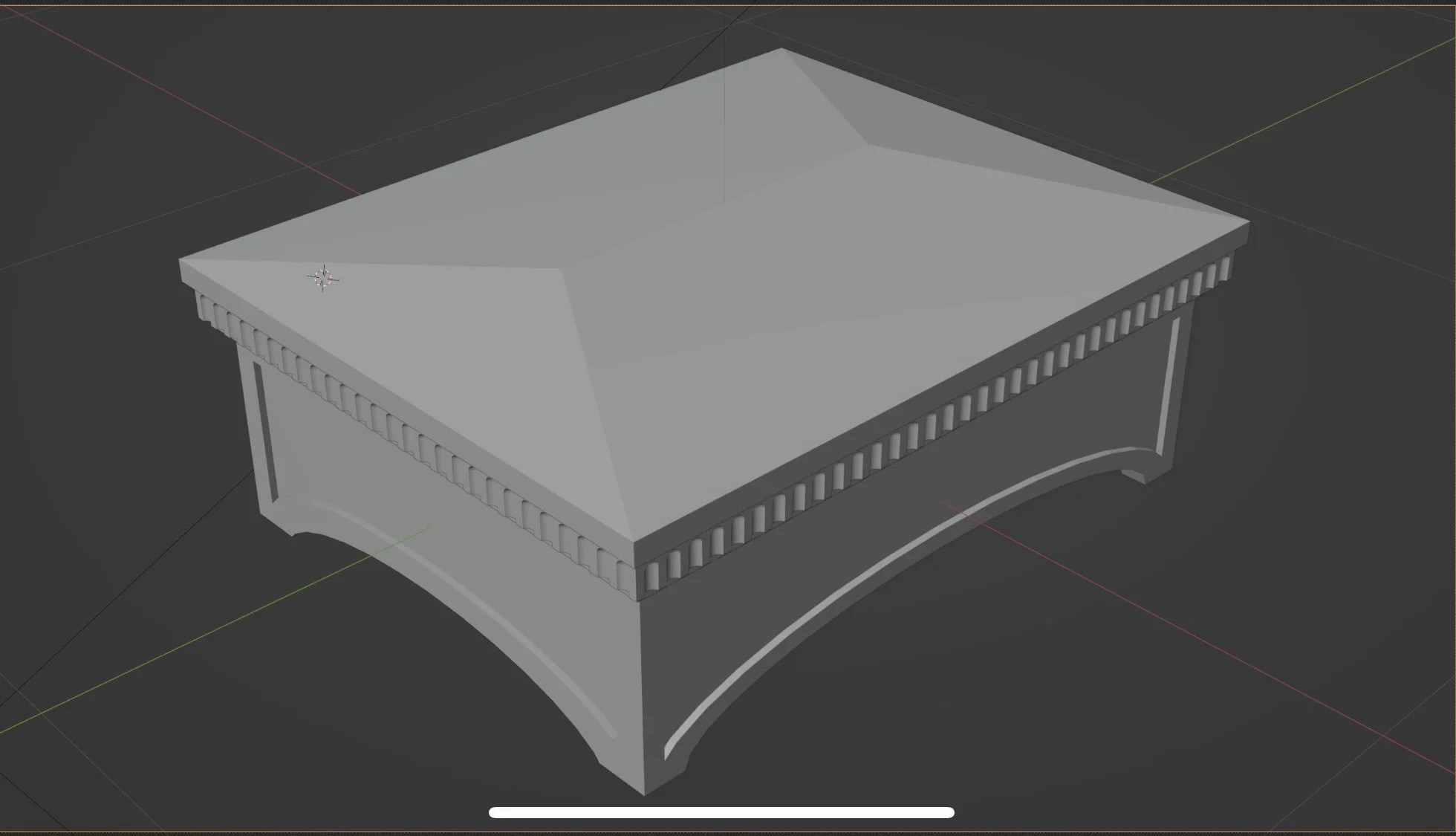
Starting the box was straightforward. It would be rectangular, to match the book’s proportions, with two types of wood: Carolina hickory and Pennsylvania white oak. I liked the idea of a pyramid-shaped lid so that nothing would ever sit on top of the box. Arched legs looked cool, and maybe some simple inlay panels would be neat. I made a mockup in a free, open-source 3D graphics program called Blender and shared it with dad.

As you can imagine, working on something like this required utmost secrecy. My desk and PC were at a coworking space at the time. This made the project easy to conceal and convenient to access on my slower freelance days, but I knew that I would eventually have frequent, lengthy conversations with my parents about it. It needed a codename.
When I thought about one of the earliest inside jokes between Molly and I, featuring an anthropomorphic red panda, I knew I could never call the work by any name other than Project Gary.

Gary - rendering courtesy of Adobe Firefly
Dad surprised me one day when he suggested the idea of making the box with a 3D printer. He had been a 3D printing enthusiast as early as 2012, when a company called MakerBot made a name for itself by selling open-source, consumer-priced 3D printers. I was hesitant. I had almost irreversibly committed myself to the idea of a handmade, purpose-built heirloom. Yet the more I thought about it, the more interesting and practical a 3D-printed project became. High-quality wood is cost-prohibitive, and iteration would have been terribly minimized if not altogether impossible if I had chosen to die on that hill. Measure twice, cut once indeed.
Dad and I are capable, but neither of us claim a level of skill that could produce a world-class ornamental project on the first try, and having maybe only one chance to get it right was more pressure than I think either of us wanted. Molly is always telling me that I shouldn’t put so much pressure on myself.
A 3D-printed box could be affordably iterated over and over again. I wouldn’t get it right the first time, but I would have a chance to get it right the twenty-fifth time if that’s what it took (it did). My Dad owned a printer from a company called Bambu Lab, their X1-C model, and generously made it available to me for this project. When he showed me a sample of something he had printed, my jaw dropped slightly. 3D printers had come a long way from MakerBot’s first products. This was the way forward.
Perhaps the most common 3D printing material, plain white polylactic acid polymer (aka PLA), looked like unglazed porcelain when printed at a high level of detail. The process leaves some telltale signs that indicate a 3D print, but I liked the fact that I could make something with clues about when and how it was constructed. If it survives far into the future, someone might be able to look at it and say “ah, this piece was actually constructed with one of the earliest forms of 3D printing… judging by the materials, layer lines, and infill, I’d date it to the mid-2020s.”
If I worked within the constraints of 3D printing’s “fused deposition modeling” (FDM) process, building layer-by-layer, the possibilities were exciting. I could use Blender to create 3D models, convert them to stereolithography (.STL) files, and load them directly to the printer in person or remotely.
The first proof-of-concept print
One of 3D printing’s biggest, most obvious creative constraints is the surface area of the print bed, upon which the layers of molten PLA polymer are applied. The Bambu Lab X1-C has a maximum print bed area of about 10” x 10”, so the box and book would need to become square if I wanted legibly-sized text and images. I acquiesced. I had plenty of ideas and opinions, but now the project was starting to tell me what it wanted to be.
3D printing is a contemporary process, but its flexibility meant my design language could be timeless. White PLA, with its unglazed ceramic, almost marble-like appearance, took my mind toward Greek and neoclassical architecture. Cornices, pediments, and fluted faces came to mind first, though it would take a long series of iteration to arrive at the final product.

The book had to be square to fit the box’s inevitable dimensions. The contents of the book had been a no-brainer: the story of Molly and I’s relationship in pictures, words, and pop-ups. The cover would be just as timeless as the box, bound in navy leather with a hot-pressed gold foil title that reads “Molly & Trent”. As impressive as it was to see mom hand-bind a mockup book during a visit home in June 2023, I was just as impressed to see her press the title with special machine that’s very heavy and hard to use because the manual is entirely in German. Luckily, mom was able to find an English translation.
It was an easy start, but the specifics of the book’s contents intimidated me. How would this book tell our story? My original attempt to answer this question involved a scrapbook-style timeline that packed an entire decade into a 14” x 7” spread, packed with impossibly small paper details. I knew my mom used an Epilog CO2 laser to fabricate some parts of her books, and ignorantly concluded that meant intricacy would be no problem.

Aside from the simple matter of (il)legibility, I was trying to do too much. I put Project Gary down for a few days and leaned on advice that I’ve received from many people throughout my life: simplify, prioritize, and focus. It took a while to figure out what to do next.
I eventually changed course: the book would have beautiful, intricate pop-ups and scenes laser-cut from layers of paper, but it would also be a chronological photo book. Rather than creating everything from scratch as one often has to do with cut paper, I could draw from albums that our parents had been building for our entire lives. The images I chose could communicate a lot of context quickly: people, places, things, and even feelings perhaps forgotten until curated and presented against a crisp white background. This felt like an elegant way to tell our story. It would be several more months until I finished this part of the project.
In late October and early November of 2023, our lives were consumed with moving from Austin to Pittsburgh. Once we arrived, we knew we had made a good decision despite all of the questions we held about where we would find work and friends. Pittsburgh, to me, is a city of humble virtue, having had ample time to grieve its transition from the steel industry and look to the future. In 2024, I think Pittsburgh is winding up for its next great chapter. I predict that the coming decade will see plenty of growth for the Steel City, and I’m optimistic about its capacity to handle the next major boom.
(Below left: Molly and I during my first visit to Pittsburgh. Below right: minutes after arriving from Austin, over 5 years later.)


In December 2023, the actual printing began. Several rounds of iteration passed quickly during my visit home for Christmas. At first, I tested to see whether I could cheat the size constraint of the printer with some clever joinery. It didn’t take much longer for me to accept that a single, large base was better because it could be printed in one fell swoop.

Versions and files started piling up on my SSD. I saw the need to impose a militant file structure, soon tracking every round of iteration (and its lessons learned) in Notion.
As I tested, variables I had never thought of came into play: layer depth, inner and outer wall size, the shape and density of the infill, fit tolerances between parts, and the temperature of not only the filament, but the bed upon which it was printed and the very air surrounding it. More on that later.
It was easy to determine my workflow. I modeled the entire box in Blender, exported individual pieces as .STL files, double-checked them in an online 3D file viewer, loaded them into Bambu’s desktop app (known to the 3D printing community as a “slicer” because of how it interprets a digital object into individual slices/layers of filament), dialed in the settings, and then checked the printer itself before commencing each print.

Dad volunteered to take on the work of checking the printer, replacing filament, keeping the print bed clean, and helping troubleshoot when I was working on the project from Pittsburgh. While our collaboration wasn’t the same as bumping elbows in a crowded wood shop while breathing in sawdust, I think we both grew more and more excited as the box moved through over two dozen iterations.
By New Year’s Day, I had printed a proof of concept, determined the approximate number of the book’s pages, and figured out their layout. Molly flew down to Charlotte from Pittsburgh a couple days before New Year’s Eve, and we drove back up to Pittsburgh together.
Molly had always said that it would be enough if I proposed with a candy Ring Pop, so I ordered a Ring Pop-shaped presentation box from Etsy. To complete the joke, I ordered a big bag of assorted Ring Pops from Amazon with the knowledge that I really only needed Blue Raspberry (Molly’s favorite), but would likely need a couple of attempts to seal the ring box in an authentic wrapper.


When I wasn’t looking for work, I was designing the box and still figuring out the contents of the book. Instead of filling it from cover to cover with cut paper, I thought it might be elegant to organize the photos into “chapters”: our childhoods, college, an academic year of long-distance, the beginning of the COVID-19 pandemic in North Carolina, three years in Austin, and our move to Pittsburgh. It made sense for a single cut-paper or pop-up scene to mark the start of each chapter.
This structure felt right, but created an immediate and significant need for a lot of photos. I had carefully kept many digital pictures from our relationship on my phone, laptop, and hard drives, though I also wanted to honor the idea that our story has a much longer arc. That meant telling the story of our lives before meeting with pictures from years when neither of us could have held a camera. Thankfully, our moms had kept a lot of photos from our early lives.
Molly’s parents were comfortable letting me parse through their entire family photo collection, which included an extensive digital archive and two large cardboard boxes overflowing with envelopes of photos spanning from the 80s to early 2000s. The individual envelopes themselves were incredibly nostalgic. Their outer branding and design of used the design language of its day with phrases like “Your memories are important to us!”, hearkening back to the time before everyone had a digital camera.
I set to work in an empty room of their home, looking through each envelope and affixing a Post-It note to the back of any photos that I considered potentially appropriate for the book. I’m not sure if Post-It adhesive would have had any deleterious effects on the photos, but I couldn’t be too careful with Molly’s family photos. I worked in 1-2 hour bursts, avoiding the work when Molly was around. Once I had made my way through all of the physical photos, Molly’s dad shared his digital archive.

Around this time I also thought about where I might propose. Moraine State Park is one of Molly’s favorite places. It’s a half hour north of Molly’s home town, surrounding Lake Arthur with plenty of hiking trails and a modestly-sized beach. In January, it was almost completely iced over. I decided to scout it anyway, referencing maps ahead of time so that I wouldn’t have to spend too much time in the cold. I walked along the north shore and took photos of potential proposal spots, then used an app I discovered during film school to check the position of the sun for each of them. I ultimately decided not to ask anyone to take photos of the proposal, but I wanted to at least have good data for a photographer just in case.
This purposeful visit was one of many great opportunities to further the project, but also to take some time alone and contemplate the meaning of it all. Through my time, attention, and work done in secret, I felt like I was honoring my love for Molly and making the meaning that I knew an engagement deserved.


When February came, I had made it through the entire McGlennen family photo archive and started scanning the selects.
My trusty HP Envy 4500 printer had been with me for almost a decade, and would again render faithful service with its 600 DPI scanning capability and passable color replication. The obsessive part of me wanted access to a museum-quality scanner, or to send photos off to be scanned digitally at 6400 DPI and 48-bit color depth. Right before Googling where a fellow might find such a service, I paused and acknowledged that I had already spent months on Project Gary. Adding the time and expense of a world-class-scan-by-mail would have been a massive momentum killer. Something had to give.
Scanning all of the photos took about three hours. Returning all of the photos to their original albums took about another hour. Molly’s dad’s digital archive added another hour and a half.
During all of this, I was also sharing my plans with Molly’s college friends and asking for any of their photos that might be appropriate for our book. They were enthusiastic to contribute.
Once I had collected all of the digital photo files in one place, I started laying them out in Adobe Illustrator. Each photo got its own 7” x 7” page, and they were arranged chronologically: while Molly was setting up lemonade stands in her picturesque home town, I was making drink coaster pyramids at Outback Steakhouse (my favorite restaurant as a kid). While she was attending her older brother’s Marine boot camp graduation, I was learning to be an older brother. Page by page, I saw how our lives unfolded in parallel before we met, and then how we became wonderfully inseparable.


I welled up more than a few times during this stage, blinking away tears before returning to the mosaic of tabs and windows on my PC. What had originally started as a 5-6 page book became nearly 100 pages of printed photos, ornate pop-ups, and a fold-out family tree that traces our families’ history back to our great-grandparents. Sentiment could never stay too long before my inner project manager politely but firmly intervened. I was far enough in to see the end product, and I could see clearly that it would all be worth it. Truly honoring this project meant keeping it moving.
At the end of February, I drove down to see my family and get some much-needed studio time.

One side effect of a larger 3D print staying on the print bed for 7+ hours is the potential for warping, especially for 90° angles on the exterior of a print. Such was the case for the corners of the box and its lid. Warping would have admittedly been a non-issue for a woodcraft project, but had reared its ugly head for this plant-based plastic marvel.
While trying to address the problem, Dad and I thought we could fix the warp by finding a way to apply pressure and heat evenly at the corners, thus slowly returning it to a perfectly flat edge. Referencing a sketch from my dad, I made a special jig that looked like a mix between a Roman aqueduct and an IKEA table. After 2.5 hours sitting on an 80 C print bed, with roughly 4 kilograms of weight distributed to the box’s four corners, it seemed like the issue was solved. We would soon discover that it wasn’t.

The compression jig we used to apply pressure on the warped corners of the box and lid. Roughly 4kg of weight sat on the top surface.
Upon further inspection, neither the box nor lid had been pressed flat. The heat-and-weight combo had worked in the way that a sawmill works to julienne a carrot: doable in theory, but in practice it’s far from an ideal level of precision. The pressure had actually created indentations on the edges of the lid, and bowed the walls of the box inward to the point that its pedestal/base would no longer fit inside. The entirety of each piece, with its PLA becoming soft in the presence of above-average heat, responded to the weight in ways we didn’t anticipate because we were focused on the corners.
The core issue, as it turned out, was a matter of temperature. Like most things, the plastic used for this project expands when it’s hot and contracts when it’s cold. As you might expect, any expansion or contraction during a process working at 0.01mm accuracy is bad. Sharp corners (exactly like the ones on the square-shaped box and lid) are notorious for warping because the contractive forces from both the X and Y axes of the corner combine, pulling the whole corner diagonally inwards at a 45° angle. Furthermore, during a long print, the lower layers of the piece have plenty of time to cool and contract drastically.
After researching the issue, I learned that warping is primarily a matter of temperature control and stability. I needed to make the X1C print bed hotter, pre-heat the print chamber before starting the long print, and disable an auxiliary fan that was constantly pumping in cold air from outside the printer’s enclosure. I also learned to create what’s known as a “brim” around each piece to enhance the adhesion of its corners to the print bed. Finally, in March, I appeared to have solved the issue. I dialed in the correct print settings for a passably flat edge on the box and its lid.
* * * * *
While addressing the warping issue, I was also quickly teaching myself how to prepare files for a professional print shop and searching for a shop that catered to maniacal one-off projects like mine. One thing I had going for me was an early decision to lay the book out in Adobe Illustrator. Five years ago, I might have used a word processor, which would have certainly set me up for a hard time later. I probably would have been laughed out of the printer’s office.
I may not use my cinematography degree on a daily basis, but I’m grateful that it imparted an acute understanding that there are many opportunities for color to be mishandled when making anything. How do you describe an exact shade of green to a stranger so that they can replicate it perfectly on a machine you’ve never seen before? I now know that the answer to this question is a mix of Pantone swatches, precise ways of measuring color, and very particular standards for calibrating and maintaining color accuracy at every step of the print pipeline.
Professional print shops, in my experience, are places of sorcery where magicians conjure ink into beautiful images that you can hold in your hand. At the risk of asking a pâtissier for a Little Debbie cake, I didn’t want to ask anyone to print the pages of this book before knowing how to communicate with them. I wanted to make sure I knew how to ask for the right green. I started to do my homework and realized the first critical step: calibrating my PC monitor. For a relatively low fee, I rented an X-rite i1Studio colorimeter from Lensrentals.
Describing the function of a digital display colorimeter is far more than I want to mix into this already-long write-up. In short, it’s the perfect tool for getting a computer monitor to look almost identical to the final, printed version of any color-sensitive project. In half an hour, the i1Studio had analyzed the way my monitors displayed hundreds of different colors before giving me a prescription: turn the brightness way down and make some slight adjustments to the red, green, and blue gain. I was finally seeing the colors on screen as they would be printed. And I realized that I needed to fix the colors for almost all of the photos I had scanned. After an hour in Adobe Lightroom, they were ready.
Below: photos before and after color correction; I was able to confidently adjust color and contrast after calibrating my PC monitors.


I could now see a full layout of color-accurate pages, arranged in order from start to finish. But these pages would be created by printing and cutting larger sheets of paper OUT of order. I would need to determine how to arrange the pages on those larger sheets so that the final outcome would be correct. I needed to make a mockup.
The most important considerations for making an accurate mockup were a) how many sheets of paper compose each signature, b) how many signatures would be in the final book, and c) how many pages would be printed on each sheet.
I hadn’t yet determined the kind of paper that I would use for the project, but after a chat with mom we determined that each signature would be made from six 14” x 7” pages. This would hopefully make the book’s construction solid without making each individual signature too bulky.
I started to pick my words carefully: pages were the final 7” by 7” squares that would be seen by the reader in the appropriate order. Sheets were larger 14” by 7” pieces of paper. Each sheet would have four separate pages, two printed on the front and two printed on the back.
Given four pages on each sheet, and six sheets in each signature, I knew that the final book would be made from at least five signatures. That was all the information I needed.


I made the mockup out of printer paper because it was quick to find and easy to work with. Taking the completed mockup apart yielded the critical information of which pages were on which sheets. While the final product read in the correct order, the individual pages seemed to be arranged almost completely at random. I double- and triple- checked my work because I knew an error at this stage would have thrown the rest of the project completely off. A random baby picture might land among our college years, or I could accidentally omit a key photo altogether. Once I had reorganized my Illustrator layout file to match the mockup, I started asking the next important question: what paper would I use?
There are more kinds of paper in the world than you can imagine, so I wanted to save myself from getting bogged down in an exhaustive search. I thought back to Austin, when I paid a visit to Precision Camera and asked them to print an earlier photo project commissioned by a family friend. When it was time to pick the paper, they brought out a sample booklet from a German company called Hahnemühle. I thought that Hahnemühle might be the solution for this project.
One morning I started to peruse Hahnemühle’s offerings in a coffee shop, along with all of the reviews and Q&As I could find. I started to grasp the specific details of what I needed. I was making an heirloom, so I needed archival-quality paper that would last, which meant acid-free cotton paper. As a matter of personal taste, I wanted a matte finish. I wanted it to be thicker than printer paper for the purposes of durability, and to have a pleasing feeling of quality in the reader’s hand.
It couldn’t be too thick though, because I had planned for the book to be 1.5” thick at maximum. Hundreds of pages of too-thick paper would swell far beyond this measurement. Paper thickness is usually expressed as “grams per square meter”, otherwise known as gsm. After a while, I determined that I was looking for paper in the neighborhood of 150-200 gsm.
Lastly, I needed double-sided paper that could printed on its front and back. This was the most important specification, and also the one that narrowed down my options the most quickly. Hahnemühle, as it turned out, didn’t have a double-sided matte archival paper any thinner than 300 gsm, which is roughly the thickness of the thickest business card you’ve ever held.
After dialing in my B&H search criteria later, the winner was clear: Moab’s double-sided Entrada rag paper.
* * * * *
There were a few nail-biting moments during this project, but one of the most memorable was the process of finding an affordable printer who would handle this project with care. Most print shops, I thought, handle high-quantity projects with high budgets and move much faster than the speed of care demanded by a one-of-a-kind sentimental object. And surely those shops have hefty minimums (or charge premiums for one-offs).
After Yelping photo printers in both Charlotte and Pittsburgh, I sent out a few exploratory emails anyway. I introduced myself and the project, hoping to gauge each shop’s interest in making this book a reality.
I only received a response from one printer in Pittsburgh. They said that this book was a little too niche for them, BUT they knew somebody who could maybe help: a local fine art photographer named Rob who made prints on the side. Rob and I were introduced in an email thread, and quickly hit it off. He made it immediately clear that he understood what I needed and that he could make it happen. After clarifying details of the project and agreeing on a budget, I told him that I would be able to share the print files with him in a matter of days.
Alongside the excitement of finding a printer and solving the warping issue, it was mid-March and I was feeling fatigued. I shared this feeling with Molly’s parents, saying that I was excited and eager to finish, but also that I could have never guessed how involved this project would become.
They nodded understandingly before offering up some wisdom: “That’s marriage!”
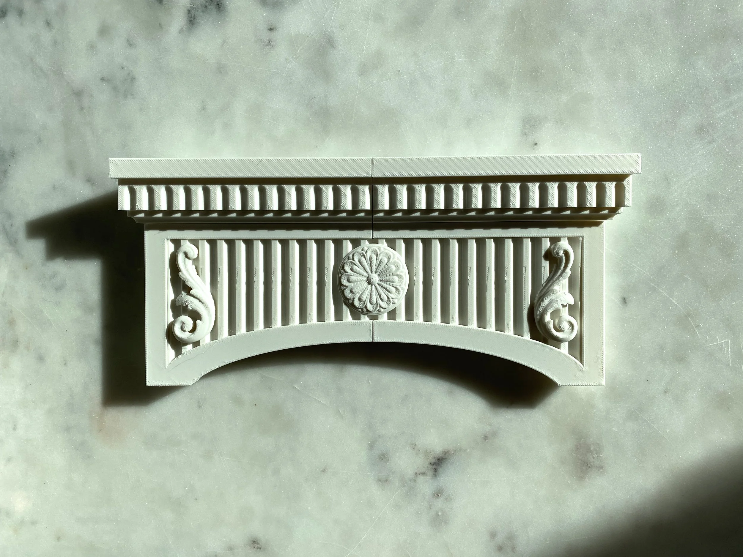
If you’ve been caught in the throes of a big project, you know that your most tired days can, paradoxically, become sleepless nights. On one such night, after Molly had gone to sleep, I found an alternate design for the main box's decorative panels. Rather than the austere-looking acanthus leaves and center medallion from my earlier test, TurboSquid.com offered a perfect-looking cartouche detail that I could drop right into the project.

Top: final design for the box’s four sides
Bottom: previous design
I had almost finished preparing the Illustrator file that would be used to print the final pages of the book. On a whim, I double-checked it against the mockup I had made, and discovered that I was missing a page. Dismayed, I double-checked everything else, but there were no other discrepancies. Close call.
After revisiting the short sections of text in the book, I made a last minute font change for legibility: Minion prevailed over Garamond.

After getting everything exactly right, I made sure that all of the project’s images were embedded into the Illustrator file so that they wouldn’t be lost if Rob asked for an Illustrator package instead of a .PDF (he didn’t). I checked the Illustrator export settings to make sure I was including trim marks and the appropriate 1/8” bleed.
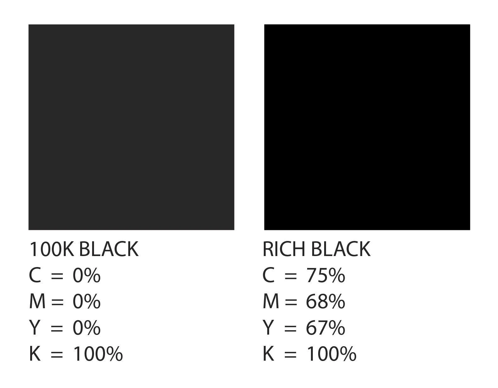
Once again, I felt like I was missing something. In my research about color management, I had seen the terms “rich black” and “100K black” but didn’t know what they meant. Thankfully, I had the energy for one last deep-dive.
100K black is simply the result of setting your black value (the “K” in “CMYK”) in a program like Illustrator to 100%. This looks fine on a screen, but can result in a printed color that looks closer to dark gray. Rich black, on the other hand, is setting K to 100% and setting your CMY values between 50-70%, depending on your circumstance and preference. This instructs the printer to print a layer of black ink, then to also add cyan, magenta, and yellow ink on top of that layer in order to create the deep black color that most of us are used to seeing in printed media.
After giving myself a night to rest, I quadruple-checked the order of the pages before exporting the final .PDF file, uploading it to my Google Drive, and sharing it with Rob.
Rob Strovers worked for most of his career as a telecom engineer in the days when demand for analog telephone and television signal transmission was at its peak. He retired after the industry pivoted to digital in the 90s and 2000s, and has worked in Pittsburgh as a fine art photographer since. His home/studio was converted from a former bank building. As a vestige from the building’s previous life, the primary bathroom is secured behind a massive steel vault door. I got to see it for myself when he invited me to review a proof before printing the rest of the book.
I had given myself a list of things to inspect during this visit, knowing that it would be easy for me to get caught up in my enthusiasm for such a cool field trip. The color quality, sharp edges, rich black tones, and paper quality were all perfect. When I took the proofs back to my desk, they looked nearly identical to the image on my newly-calibrated PC monitors. Phew. Had I not rented the colorimeter, that moment would have probably been deeply disappointing.
Rob’s career and personality, I supposed, had predisposed him to care about precision as much as I did. Aside from a small alignment issue, which he had already started solving, I didn’t have any notes for Rob and thanked him after paying the agreed-upon 50% deposit for my project. I would return in a few days for the finished pages.

Meanwhile, another vital part of the book was still undone. I had barely put any time into designing and preparing the vector files that mom would use to create the book’s intricate, laser-cut paper chapter markers.
Growing up, I’ll admit that my tendency was to dream up a complex project and ask my parents to make it. They were usually game, and they knew how to deliver, but growing up means realizing just how much effort goes into making real the dreams of a child. I didn’t want this to be anything like that; mom and I were collaborators now. Knowing how long it can take to create something from scratch, I wanted to offer up digital files that she could import, adjust, and prepare to cut on her CO2 laser with relative ease.
These cut-paper chapter markers are perhaps the most scrapbooky parts of the project, only because they’re incredibly specific and eclectic. I made the preliminary files, one by one, in Adobe Illustrator. Each scene was composed of multiple paper layers, so I exported the individual layers as .SVG vector files alongside .JPG renderings of the final product and the reference photos I used for each scene.

Top left: reference image from Google Earth
Bottom left: rendering of the finished cut-paper scene
Right: the same scene, separated into layers
My favorite scene was actually two separate compositions: Molly’s childhood home, opposite from a map of her hometown, and my childhood home with a similar kind of map on the following pages.

I uploaded a folder for each scene, containing its vector files and renderings, to a shared Google Drive folder that my mom could access remotely. Once Rob had finished printing and trimming the book’s pages, I picked them up and thanked him profusely for his stellar work. I had asked Rob to leave the printed pages untrimmed on their longer edge, because their absolutely final length would be determined after folding them into signatures. As you can imagine, six pages with equal lengths folded into a signature looks less polished than the same pages first folded into a signature and then trimmed uniformly. Rob was up to the task, but I wouldn’t be surprised if he decides not to take up any more projects like mine.
Rob gave me a plastic sleeve to keep the pages secure, and I sandwiched that sleeve between two stiff pieces of cardboard for added security before sliding them vertically into the pocket on the back of my truck’s passenger seat. I didn’t want to risk any errant folding, wrinkling, or imprinting. On Good Friday, feeling a little guilty for leaving Molly behind yet again, I drove down to see my parents and their studio one more time.
A week before this trip, I had taken yet another deep dive into the world of finishes and sealants for 3D prints. Knowing that PLA is prone to weakening in the presence of moisture and UV radiation, I knew I needed something that would offer protection from both. Cosmetically, I was happy with the color matte finish of the plain white PLA, so I needed a clear, matte sealant.
I could choose between two primary types of sealant: polyurethane or acrylic. While both options were available in spray cans, I read that polyurethane sometimes tends to yellow over time and is typically better suited for wood projects. 3D printing forums seemed to favor clear acrylic spray-on sealants above all others. I discovered that Krylon makes a clear, matte-finish, UV resistant spray-on acrylic adhesive meeting all my criteria.
I ordered two cans, knowing I would probably need to test and practice. Since aerosol cans are considered hazardous items in the world of commercial shipping, and sometimes take a bit of extra time to process, I crossed my fingers that they would arrive at my parents’ house in time.
* * * * *
The drive from Pittsburgh to my hometown is roughly 8 hours long. The route winds down through the Appalachian Mountains predominantly on I-79 and I-77, making time for plenty of podcasts and Sheetz snacks. Two views always make the drive worthwhile: the New River Gorge, and a sweeping view of the North Carolina Piedmont as it’s slowly revealed on I-77S at the edge of the Appalachians in Fancy Gap, Virginia. This incredible view also signifies that I’m only 2 hours away from home.
While we enjoyed each others’ company for Easter, my family understood that this was a work trip. Mom and I reviewed each of the vector files for the intricate paper cut-outs, then organized all of the printed pages into their proper order. She polished up the paper files before engineering two separate pop-up pages while I finished the box. My young sister, Morgan, just as gifted as the rest of our family, worked on a hand-drawn scene for the book that portrays the campus of my and Molly’s alma mater.

With the warping issue solved, the 3D printing was mostly done except for repeats that would replace earlier prints with cosmetic defects. I reprinted the necessary pieces and roughly assembled the box. Once I saw all the pieces fitted together, it felt like this project was in the home stretch.
Choosing an adhesive to glue the box together was easier than choosing a sealant. My parents both pointed to E6000 polyurethane adhesive as the best choice due to its strong bond, fast drying time, applicability to multiple materials, transparent finish, and indoor/outdoor durability. Applying E6000 with a precision syringe made it even better-suited for the task.
Before gluing, I printed four alignment brackets to perfectly center the upper and lower parts of the box’s lid.
Gluing and setting the box was quick and easy. I wore latex gloves to avoid contact with the adhesive, and made sure there was plenty of air circulation in my workspace to minimize fumes from the E6000. If I had been working with the adhesive for a long time, I probably would have needed a chemical respirator. When I could, I used miniature Irwin quick-grip clamps to ensure that every piece of the box was fitted tightly.
I chose to leave the base/pedestal for last, just in case I needed to make any final adjustments to accommodate the final book size. That proved to be a wise move.
Mom had nearly finished preparing the files that would be used for the paper cutouts, and it was time to take inventory. I broke down each cutout by color and amount of paper required to make a detailed shopping list, then shared my mockup renderings so that we could reference them on our phones at the store if necessary. My parents’ house is roughly 30 minutes from most of stores in our hometown, and a childhood of multiple visits to the hardware store had taught me that it was better to make one highly-planned trip than lose another hour to a second trip or more.
As I’d hoped, we found all the paper we needed in one trip to the craft store. I laid out the individual sheets on a table in the framing department, organizing them by scene, determined not to miss anything. An almost-too-good-to-be-true coupon reduced the price of several dozen sheets of high-quality craft paper to less than $40. We had a nice lunch before returning to the studio.
Mom expressed to me that she was having a lot of fun. That was a relief relieved, because I was definitely feeling the hours and hours of time accumulated on this project. Her energy helped me rally, yet I was also thinking twice about every decision because re-doing any part of the box or book would cost time that was becoming more and more precious by the second. In just a couple more days, I would return to Pittsburgh. I hoped that I could bring the finished book and box with me.
Below: the Epilog CO2 laser at work
While Mom worked solo on the book’s paper cut-outs, I kept myself busy by animating the box assembly. Remembering some friendly advice from Rob to keep the pages dry, I also re-worked the pedestal to include an alcove just large enough to house a 1-gram packet of silica gel desiccant. I had enough of an idea about the book’s final thickness that I chose to start printing the pedestal, also calculating that I had enough time for a re-do if I really needed one. This final version of the inner pedestal / box base included another fun detail: “MMXXIV” inset on the bottom, forever marking the year of our engagement in Roman numerals.
Below: animation of the box’s assembly
By 6pm on the evening before I was planning to drive home, I saw that mom was getting frazzled. She had been working for twelve hours, pressing to get the book done, but still had more to go. I knew she intended to keep going if it was the only option, but I also knew that there was a more reasonable and compassionate option. I just added a day to my stay. It was difficult to explain the surprise change of plans to Molly. I knew it would be okay in a week or two when I could explain myself, hopefully as her fiancé.
Before dinner the following day, the book was finished. I sprayed 3 coats of sealant onto the box and pedestal, then glued it all into place.
It was done.


I made dinner for my family and thanked them all for contributing to my engagement surprise for Molly.
It had come full circle, back to an act of contemplating the significance of marriage after passing through near-manic attention to paper thickness, the merits of different acrylic sealants, and so very much time in Blender. We enjoyed our meal together before I left the next morning, excited for what was coming.
* * * * *
I shared the finished book and box with Molly’s family, pleased to be holding what had been a work-in-progress for months. They already knew, in great detail, my plan to propose:
Molly and I would visit Moraine State Park, enjoying a picnic on a sunny day. I would return to my truck for a “surprise”, then bring her the box. She opens it, we look at the book together and the final page would be handwritten, reading “On April 15th, Trent asked Molly to marry him at Moraine State Park.” Opposite, a fun and very well-made pop-up of a blue raspberry Ring Pop.
I would get down on one knee, say words that I’ve wanted to say to Molly for a long time, take the Etsy Ring Pop from my pocket, remove it from the standard-issue foil package, then open it to present her with the actual ring.
And that’s how it happened. I decided not to ask anyone else to take pictures or video of the moment. I wanted to be fully present with the love of my life. It was just the two of us, sitting by the lake on a perfect day.

Looking back, this project was a way to give special love, care, attention, and intention to my beloved on one of the most important days in our relationship. It’s part of how I choose to honor the prospect of spending the rest of our lives together. I’m grateful to have been able to make this heirloom with my family. It will stay with Molly and I for the rest of our lives.
I don’t regret that it took so long- in fact, I’m pleased that it made so much time and space for me to sit with the full feeling of what it means to choose another person to spend my life with. By making this book and box, I ended up creating and walking through my own rite of passage, coming out the other side as an ecstatic fiancé to the most wonderful woman on the planet.
* * * * *
Thank you for reading. Hopefully you enjoyed this behind-the-scenes look at Project Gary, or at very least got a couple of hard-earned tips for bookmaking and/or 3D printing. As a maker and a sentimental person, I saw it as my duty to share the thoughts and processes behind this once-in-a-lifetime project. Maybe it will inspire you to take on your own labor of love.